
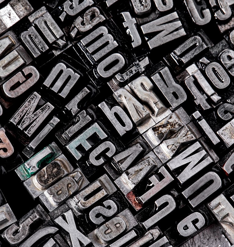
Most book interior and cover designers already understand their role in emulating the tone of a word or a sentence using type. They already know the difference between a font and a typeface. They understand terms like x-height, em dash vs. en dash, optical margin alignment, tracking vs. kerning, and how leading affects readability. These aren’t just jargon—they’re the hidden architecture of a professionally designed book. Most designeres in the book manufacturing trade know well and understand that typography is the silent workhorse of every great book — but it’s also one of the most misunderstood aspects of publishing, particularly among self-publishing artists and craftspeople and small presses looking to cut corners.
A seasoned book designer might fret over the tracking of a paragraph or cringe at a slight kerning miscue—details most readers will never consciously notice. But that’s the point: these subtle choices are what make a book feel seamless, readable, and trustworthy. Yet fewer designers truly understand how these micro-mechanics connect to the strategic decisions behind typography—decisions behind selecting a font; a typeface for a novel and a nonfiction book (and even a user interface). Choosing a typeface isn't just about picking something legible or stylish—it’s about selecting the visual voice of the book. Typography is the carrier of tone, mood, and genre. How do you express suspense, warmth, authority, or nostalgia through a set of characters? In fact, in book design, type isn’t decoration—it’s storytelling.
Interestingly, of course in book publishing, when typography is done right, no one notices. But when it's wrong? It makes the book seem tacky, drags the reader out of the action, and trammels the author’s expression.
From a publisher’s perspective, selecting a typeface isn't an academic exercise—it’s a business decision. When they hire a book designer, they aren’t looking for a lecture on serifs, ligatures, or oldstyle numerals. They want to know: Why this typeface? How does it serve this manuscript, for this audience, in this genre?
Fonts vs. Typefaces: What’s the Difference?
The terms font and typeface are often used interchangeably, but they refer to distinct things in typography.
A typeface is the overall design of letterforms—a cohesive visual style that includes a range of characters with varying weights, widths, and styles (like bold, italic, or light). Think of it as the design family.
A font, on the other hand, is a specific style and size within that family. For example, Helvetica Bold 12pt is a font; Helvetica, as a whole, is the typeface.
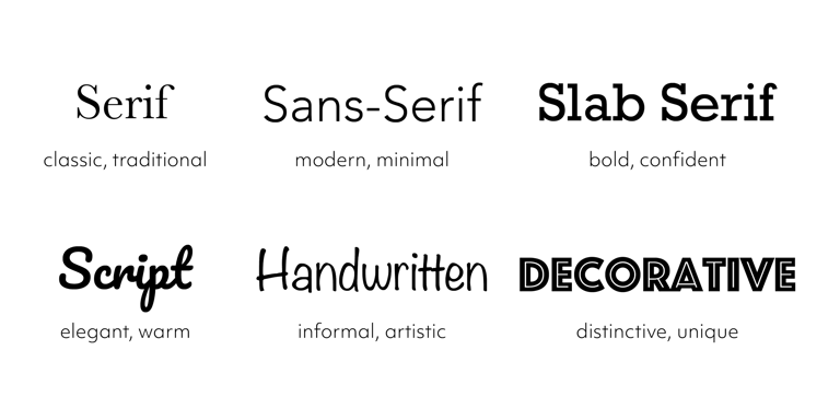
There are three main categories of typefaces:
Serif – classic with small lines or strokes at the ends of letters
Sans Serif – clean and modern without the extra strokes
Decorative (or Display) – stylized fonts typically used for headlines or emphasis
A professional designer typically limits a project to no more than three fonts to maintain visual clarity and hierarchy. Decorative fonts should be used sparingly to avoid visual clutter. Understanding this distinction helps elevate both the aesthetics and function of your design.
Publishers expect designers to align form with function. A good book designer understands that typography carries mood, pace, and credibility. Choosing the wrong typeface for a cozy mystery or a theological memoir can be as jarring as casting the wrong actor in a film. It’s not just about aesthetics—it’s about how design choices support market position, reader expectations, and sales.
In this sense, typography is strategy. The publisher is trusting you not only to make the book beautiful, but to make it sellable. That means understanding the psychology of type, genre conventions, and how your design decisions translate to real-world results—from bookstore shelves to Amazon thumbnails to audiobook covers.
The best book designers don’t just know fonts—they know publishing.
Now let’s consider what publishers — especially indie publishers — get wrong.
The Strategic Use of Italicization, Bolding, and Underlining
A refined book design doesn’t stop at font choice or margin control—it extends to how typographic emphasis tools like italics, bold, and underlining are used. These elements may seem small, but their impact on readability, narrative tone, and message delivery is enormous.
In fiction, italicization is commonly used to indicate inner thoughts, emphasize emotion, or distinguish foreign words, ship names, or dream sequences. It adds nuance without shouting. Overuse, however, can interrupt pacing and fatigue the reader. Bolding in fiction is rare and often discouraged, while underlining is almost never used—it breaks immersion and feels dated.
In nonfiction, especially academic, instructional, or business titles, bold is a powerful tool for emphasis—highlighting keywords, key phrases, or section headers to help guide scanning and retention. Italics serve to emphasize concepts, clarify definitions, or cite titles and sources. Underlining might still appear in instructional materials or workbook-style formats, but even then, it should be used minimally to avoid visual clutter.
Good designers apply these tools with restraint and precision. Too much emphasis flattens meaning—just like overusing exclamation points. But when used with intention, these typographic treatments shape hierarchy, focus, and reader flow, helping the design speak as clearly as the words do.
Fix: Use italics for clarity and subtle emphasis. Use bold for structure and importance in nonfiction. Avoid underlining unless the format calls for it (like fill-in-the-blank workbooks). Every choice must serve readability and storytelling—not decoration.
Utilizing Fonts That Don’t Match the Style
Perhaps the biggest mistake authors make with their genre fonts is picking a font that doesn’t look right the genre they’ve written in.
You’re not going to put a slapstick comedy movie poster out in the same type font you’d use for a horror. So then, why do we still see memoirs in quirky typefaces and thrillers in fetching scripts? Fonts carry emotional weight. They say genre, tone and professionalism — all before a single word has been read.
Fix: Design the cover with fonts that reflect the mood and genre of the book. For fiction I will go with a nice serif which can be something as clean as Garamond, Minion Pro. Sans-serifs such as Helvetica or Source Sans Pro are perfect for business or self-help titles. Ask your designer—not Canva.
Neglecting Readability in the Interior
Good book design speaks softly and happily. It never shouts over the words—it whispers them clearly, page after page. At the heart of this is readability, the most crucial yet overlooked principle in interior layout.
Readability is not about margins that are too tight. Text that’s too small. Lines that stretch needlessly across the page. These are decisions that turn reading either a physical book or a digital copy into an ordeal. It should call your eye in, and walk you through a page smoothly.
Readility is about line length, leading (line spacing), margin balance, and typeface consistency. Readability goes beyond simply choosing a "nice-looking" font. It’s a delicate balance of typeface selection, line length, leading (line spacing), margin structure, and visual harmony. Mixing serif and sans serif fonts—such as using a classic serif for body text and a clean sans serif for chapter titles or section headers—can add smartness and hierarchy to the layout, subtly guiding the reader’s attention without overwhelming them.
Designers often use different fonts intentionally to add contrast and rhythm. A serif typeface may evoke tradition, trust, or elegance, while a sans serif introduces clarity and modernity. But the key is consistency and restraint: font pairing must feel intentional, not chaotic.
The goal is to reduce fatigue and keep the reader immersed. True readability is about reducing eye fatigue and sustaining immersion. A poorly spaced paragraph or an overly tight layout introduces visual friction that interrupts the reader’s flow—even if they can’t name what’s wrong. A well-designed page, on the other hand, becomes invisible in the best way, allowing the content—not the design—to shine.
Professional book designers understand the rhythm of the page. They know not to crowd margins, when to avoid full justification, how to control hyphenation zones, and which serif fonts lend themselves best to long-form reading. They build pages that breathe—quiet, inviting, and effortless to move through.
A well-designed book interior is invisible—but essential. Without it, the most brilliant content can feel like a chore.
Fix: The correct interior typography takes font size, line spacing, margins and justification into consideration. A good book designer will create comfortable, reader-friendly pages—particularly for read-inspiring long-form content.
Treating Typography as Decoration
Alas! Type isn’t just about looking good — it’s about communicating clearly. When fonts get in the way of reading, readers pay the price. Beauty without form is formless on the page.
Fix: All typographic choices should reflect legibility, tone, pacing and storytelling purposes. It’s not just visual but experiential, typography.
Ignoring the Print Format
What looks good on a screen doesn’t necessarily print well. Anything a designer does not consideraccess to, size, bleed, spine, grayscaleis a failure in a production setup.
Fix: Know what technical specifications there are for the platform you choose (KDP, IngramSpark, Blurb etc) and see how fonts should be prepared for the format and test that before you upload. A well designed print book is a tactile experience — not a stretched PDF.
The Bottom Line?
Typography isn’t an afterthought. It is the architecture of your book. When designers and publishers get it right, books come alive. When they do their job right, books feel like the classics.
I help authors and indie publishers get it right—on every page.
Need help with your interior layout, typesetting, or cover typography? Let’s build a book that doesn’t just sit on a shelf—but sells.

What Designers and Publishers Miss About Typography
J U L Y 2 0 2 5

Bio
I'm Okang’a Ooko—a novelist and senior book designer with deep roots in publishing, storytelling, and design. I specialize in helping publishers and agents deliver polished, compelling books that resonate with their markets. Whether you’re producing high-volume titles or championing a first-time author, my design solutions ensure your books look as powerful as the stories they tell, captivating readers, and reflecting professional quality from cover to final page. As an author, my novels explore history, politics, culture, music, love, and identity—told through emotionally rich, character-driven narratives that captures nostalgia, societal conflict, and the personal struggles of those facing change and disconnection. Read more »
Ready to transform your story into something unforgettable? Okang'a Ooko specializes in end-to-end creative solutions for authors, publishers, literary agents, and storytellers. Whether you're crafting your first novel, launching a brand, or building an author platform, he's here to guide you from concept to creation. Learn more »
With decades of experience in storytelling, publishing, and visual design expertise. Ooko helps you bring your book, brand, or message to life—beautifully, strategically.
Turn your vision into a lasting impression. Hire Okang'a Ooko »
Hire Okang'a Ooko
Connect With Me
© 2026. All rights reserved.
Terms and Conditions I Refund Policy I Privacy Policy